You've seen it happen. You connect with someone on LinkedIn—they look polished, professional, approachable in their profile photo. Then you visit their website, and there's a completely different person staring back: different style, different energy, different vibe. You check their email signature, and yet another photo appears. By the time you've encountered three or four versions of this person across different platforms, you're left with a nagging question: which one is the real them?
This scattered professional image problem is more common than you might think, and it's quietly undermining professional credibility every single day. When your photos look dramatically different across platforms—different styling, different backgrounds, different expressions, different quality—you create visual confusion that erodes trust and recognition. People struggle to remember you because they can't form a consistent mental image. Your professional brand feels fragmented rather than cohesive.
The solution isn't complicated, but it does require intentionality: building a visual personal brand through consistent professional photos across all platforms. This means creating a cohesive photo library where every image—whether it's on LinkedIn, your website, email signature, social media, or speaking materials—feels like it belongs to the same professional identity. The photos can vary in context and setting, but they share consistent elements that make them unmistakably you.
This comprehensive guide will teach you how to build a strategic, cohesive visual brand through professional photography. You'll learn the core elements that create visual consistency, how to build a professional photo library that works across all platforms, and a step-by-step framework for implementing visual brand consistency. Whether you're an entrepreneur whose face is your brand, a corporate professional building your career, a consultant establishing authority, or a small business owner creating marketing materials, visual consistency is your competitive advantage.
The best part? Once you understand the framework, creating consistent professional photos becomes straightforward. You'll make better decisions about what to wear, how to pose, and which photos to use where. You'll build recognition, trust, and professional authority through the simple power of visual consistency. Let's build your visual personal brand.
Why Visual Consistency Matters for Your Professional Brand
Visual consistency isn't about vanity or perfectionism—it's about psychology, recognition, and trust. Human brains are wired to recognize patterns and faces. When we encounter the same person looking dramatically different across contexts, our brains work harder to reconcile the differences, creating cognitive friction that translates to reduced trust and memorability.
Research in cognitive psychology shows that visual consistency enhances recognition by up to 80%. When people see consistent visual branding—the same colors, similar styling, cohesive aesthetic—they recognize and remember you faster. This recognition translates directly to professional opportunities. When someone thinks "I need a consultant for X," you want your face to immediately come to mind. Visual consistency makes that mental retrieval easier and more likely.
The "scattered identity" problem manifests in subtle but damaging ways. Imagine a potential client researching you before a meeting. They see your LinkedIn photo—professional, navy blazer, clean background, confident smile. They visit your website and find a casual photo from a vacation, bright colors, sunglasses, beach background. They receive your email and see a grainy, poorly lit photo from five years ago. What impression does this create? At best, it suggests you're not detail-oriented. At worst, it raises questions about authenticity and professionalism.
For entrepreneurs, consultants, coaches, and solopreneurs, this matters even more. Your face IS your brand. When people hire you, they're not hiring a faceless corporation—they're hiring you, the individual. Your visual consistency directly impacts their confidence in that decision. A cohesive visual brand signals that you're intentional, professional, and trustworthy. Scattered, inconsistent photos signal the opposite.
Corporate professionals benefit from visual consistency too, though for different reasons. In competitive job markets and crowded industries, standing out while maintaining professionalism is crucial. A consistent visual brand helps you be memorable without being unprofessional. When recruiters, hiring managers, or potential collaborators encounter your profile multiple times across different platforms, visual consistency reinforces your professional identity rather than creating confusion.
The business impact is measurable. Professionals with consistent visual branding across platforms report higher engagement on LinkedIn, more website conversions, increased speaking opportunities, and stronger client relationships. The mechanism is simple: consistency builds trust, trust enables opportunity, opportunity drives success.
The Core Elements of a Cohesive Visual Brand
Creating visual consistency doesn't mean wearing the same outfit in every photo or using identical backgrounds everywhere. It means establishing core visual elements that appear consistently across your photos, creating a recognizable aesthetic while allowing appropriate variation. Four elements form the foundation of visual brand consistency.
Color Palette and Styling Consistency
Color is one of the most powerful tools for creating visual consistency. When you choose 2-3 signature colors that appear consistently across your professional photos, you create instant visual recognition. These colors should appear in your clothing, backgrounds, and overall aesthetic.
Choosing your signature colors requires balancing personal preference, what flatters your skin tone, and what aligns with your professional brand. If your brand is trustworthy and authoritative, navy, gray, and white create that impression. If your brand is creative and energetic, you might choose bolder colors like coral, teal, or burgundy. If your brand is warm and approachable, earth tones like camel, olive, and cream work beautifully.
The key is consistency, not rigidity. You don't need to wear navy in every single photo, but navy should appear frequently enough that it becomes associated with your visual brand. You might wear a navy blazer in your primary headshot, a navy dress in lifestyle photos, and have navy accents in your website photos. This repetition creates cohesion without monotony.
Wardrobe consistency extends beyond color to style and formality level. If your primary headshot shows you in a tailored blazer, your other professional photos should maintain a similar level of polish—perhaps business casual rather than ultra-formal, but not suddenly switching to athletic wear or overly casual clothing. The formality level should be consistent with your industry and brand positioning.
Building a photo-ready capsule wardrobe makes this easier. Invest in 10-15 versatile pieces in your signature colors that work together and photograph well. A navy blazer, white button-down, gray sweater, black tailored pants, and a dress in your accent color can create dozens of outfit combinations while maintaining visual consistency. Every photo feels cohesive because the color palette and styling remain consistent.
Background and Setting Consistency
Your background choices communicate as much as your clothing and expression. Clean, minimal backgrounds suggest modern professionalism and focus. Office or professional settings communicate credibility and expertise. Lifestyle or environmental backgrounds (coffee shops, outdoor settings, creative spaces) suggest approachability and authenticity. The key is choosing a background style that aligns with your brand and using it consistently.
This doesn't mean every photo needs an identical background—that would look strange and artificial. Instead, choose a background category and stay within it. If your brand is clean and modern, use various minimal backgrounds: white walls, light gray backgrounds, simple indoor settings with minimal distraction. If your brand is warm and approachable, use various lifestyle settings: coffee shops, outdoor parks, home offices with personality. The specific location can vary, but the overall aesthetic remains consistent.
Industry considerations matter here. Consultants and coaches often benefit from clean, minimal backgrounds that keep focus on them without distraction. Creative professionals—designers, photographers, artists—can use more interesting, personality-filled backgrounds that showcase their aesthetic sensibility. Corporate executives typically use professional office settings that communicate authority and credibility. Small business owners might use their actual business location, creating authenticity and connection.
The indoor vs. outdoor decision also affects consistency. Natural outdoor light creates a different mood than indoor professional lighting. If your primary headshot is indoors with professional lighting, most of your professional photos should follow that pattern. If you prefer natural outdoor light, maintain that across your photo library. Mixing dramatically different lighting environments creates visual inconsistency.
Practical tip: When planning photo sessions, choose 2-3 background locations within your chosen aesthetic category. Shoot multiple outfits and poses in each location. This creates variety while maintaining the consistent background style that defines your visual brand.
Lighting and Mood Consistency
Lighting creates mood, and mood communicates personality and brand. Bright, airy lighting with soft shadows creates an energetic, approachable, optimistic mood. Dramatic lighting with stronger shadows creates a serious, authoritative, sophisticated mood. Natural, even lighting creates an authentic, trustworthy, accessible mood. Your lighting choices should align with your brand attributes and remain consistent across photos.
The "bright and airy" aesthetic—characterized by lots of light, minimal shadows, and an overall luminous quality—works beautifully for brands that are approachable, optimistic, and modern. This lighting style is popular among coaches, consultants, and creative professionals who want to appear accessible and friendly. It photographs well and feels current.
The "dramatic and moody" aesthetic—characterized by directional lighting, defined shadows, and richer tones—works for brands that are authoritative, sophisticated, and premium. This lighting style suits executives, luxury service providers, and professionals in traditional industries who want to communicate gravitas and expertise.
The "natural and authentic" aesthetic—characterized by soft, even natural light without dramatic shadows or excessive brightness—works for brands that prioritize authenticity, trustworthiness, and relatability. This lighting style suits professionals who want to appear genuine and down-to-earth without sacrificing professionalism.
Choose your lighting mood based on your brand attributes, then maintain it consistently. If your primary headshot uses bright, airy lighting, your other professional photos should follow that pattern. Suddenly switching to dramatic, moody lighting in your website photos creates visual dissonance that undermines brand consistency.
Technical considerations: Natural window light is the most accessible way to achieve consistent lighting for DIY photos. Position yourself facing a large window with soft, indirect light (not harsh direct sunlight). This creates flattering, even lighting that's easy to replicate across multiple photo sessions. For professional photography, communicate your preferred lighting style to your photographer and show reference photos that capture the mood you want.
Expression and Energy Consistency
Your facial expression and overall energy in photos communicate personality and approachability. Some professionals naturally gravitate toward warm, genuine smiles that create immediate connection. Others prefer confident, neutral expressions that communicate authority and seriousness. Still others use thoughtful, engaged expressions that suggest intelligence and depth. None of these is inherently better—what matters is consistency with your brand and authenticity to your personality.
Finding your authentic professional expression requires self-awareness and experimentation. What expression feels natural and comfortable to you? What expression aligns with how you want to be perceived professionally? What expression suits your industry and audience? The intersection of these three questions reveals your authentic professional expression.
For most professionals, a genuine smile with engaged eyes creates the best balance of approachability and professionalism. This expression works across industries and contexts, communicating warmth without sacrificing credibility. The key word is genuine—forced, fake smiles are immediately recognizable and undermine trust. Practice finding a smile that feels natural by thinking of something that genuinely makes you happy while being photographed.
Some professionals, particularly in traditional or serious industries (law, finance, medicine), may prefer a more neutral, confident expression. This can work beautifully if it's authentic to your personality and appropriate to your context. The risk is appearing cold or unapproachable, so ensure your eyes remain engaged and your overall energy feels confident rather than stern.
Energy consistency matters as much as expression. Some professionals have naturally high energy—dynamic, animated, expressive. Others have naturally calm energy—steady, grounded, thoughtful. Your photos should reflect your authentic energy level consistently. If your primary headshot shows you with calm, grounded energy, suddenly appearing highly animated in lifestyle photos creates disconnect.
The professional rule: Your expression and energy should be consistent enough that people recognize you across photos, but authentic enough that you feel comfortable and genuine. Forced consistency that doesn't match your personality will always look and feel wrong.
> Ready to create professional photos with perfect consistency? Glowup's AI ensures your photos maintain cohesive style across all your professional needs. Try it free at https://glowuplab.app/
Building Your Professional Photo Library: What You Actually Need
A strategic professional photo library isn't about having hundreds of photos—it's about having the right photos for every context you'll encounter. Most professionals need between 5-20 photos depending on their career stage, industry, and how they use visual content. Understanding what photo types you actually need prevents both under-preparation (scrambling for photos when opportunities arise) and over-investment (paying for photos you'll never use).
The Essential Photo Types Every Professional Needs
Primary headshot: This is your flagship photo—the one that appears on LinkedIn, your website homepage, email signature, and anywhere you need a single, definitive professional image. It should be shoulders-up or chest-up, with clean background, professional attire, and your authentic professional expression. This photo gets the most visibility and makes the strongest first impression, so invest in getting it right. Update it every 1-2 years or whenever your appearance changes significantly.
Secondary headshot variations: Having 2-3 alternative headshots gives you flexibility for different contexts while maintaining consistency. These might include: same outfit and background but different expression (smiling vs. neutral), same expression but different outfit (blazer vs. sweater), or same outfit but different background (indoor vs. outdoor). These variations let you refresh your visual presence without completely changing your look.
Full-body professional photos: For speaking engagements, about pages, team photos, and contexts where you need more than just a headshot, full-body photos are essential. These should show you in professional attire, with good posture, in settings that align with your brand. Full-body photos are particularly important for entrepreneurs, speakers, and anyone who does in-person professional work.
Working/lifestyle photos: These photos show you in action—at your desk, with clients, presenting, working on your craft. They add authenticity and personality to websites, social media, and marketing materials. Working photos help potential clients or employers visualize working with you. They should feel natural and candid (even if they're staged) while maintaining the professional polish of your other photos.
Casual professional photos: These are less formal than your primary headshot but still professional—perhaps business casual attire, more relaxed settings, or more personality-driven expressions. These work well for social media, blog posts, newsletters, and contexts where you want to be approachable and relatable while remaining professional. They show different facets of your personality while staying within your visual brand.
Platform-Specific Requirements
Different platforms have different technical requirements and contextual expectations. Understanding these helps you prepare photos that work everywhere without constant re-shooting.
LinkedIn: Requires square or vertical headshots, ideally 400x400 pixels minimum. The platform crops to square, so ensure your face is centered and not cut off. LinkedIn context is professional networking and career development, so your photo should be polished and credible. Your primary professional headshot works perfectly here.
Website: Needs vary by page. Homepage hero images often work best as horizontal, full-body or three-quarter shots that show personality and professionalism. About pages benefit from a mix of headshots and lifestyle photos that tell your story. Team pages need consistent headshots across all team members. Ensure all website photos are high-resolution (at least 1200px wide for hero images) and optimized for web loading speed.
Email signature: Requires small format (usually 150-200px square) that remains recognizable at tiny size. Your primary headshot works well here, but ensure it's cropped appropriately and the file size is small (under 50KB) so it doesn't slow email loading. Keep the background simple—complex backgrounds become muddy at small sizes.
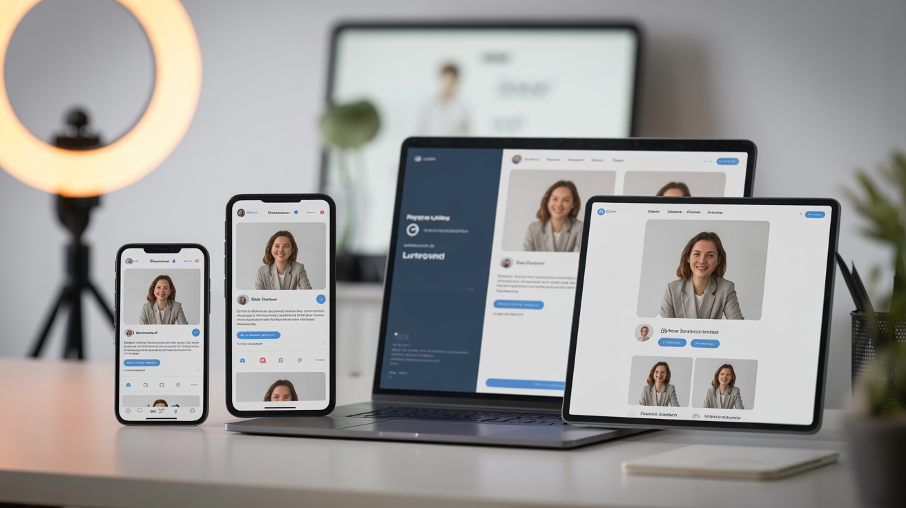
Social media: Each platform has different dimensions. Instagram prefers square (1:1) for feed posts and vertical (9:16) for stories and reels. LinkedIn and Facebook work with various aspect ratios. Twitter/X uses horizontal (16:9) for optimal display. Having your key photos in multiple aspect ratios ensures they display well everywhere. Social media context is more casual and personality-driven, so your casual professional photos work well here alongside your primary headshot.
Speaking/media: Event organizers and media outlets typically request high-resolution professional headshots (300dpi, at least 2000px wide). They may also want full-body photos and action shots of you speaking or working. These photos need to be your absolute best quality—they'll be printed large, displayed on screens, and represent you to audiences. Maintain a folder of high-res professional photos specifically for these requests.
Print materials: Business cards, brochures, conference materials, and other print applications require high-resolution photos (300dpi minimum). Colors can appear different in print than on screen, so if you're doing significant print work, consider having your photos professionally color-corrected for print. The formality level should match the material—business cards get your primary headshot, while brochures might include lifestyle and working photos.
How Many Photos Do You Actually Need?
The minimum viable photo library for most professionals includes 5-8 core photos: one primary headshot, 1-2 secondary headshot variations, 1-2 full-body professional photos, and 1-2 working/lifestyle photos. This covers all essential use cases without overwhelming you with options or requiring significant investment.
A comprehensive photo library for professionals who use visual content extensively (entrepreneurs, speakers, content creators, consultants) includes 15-20 photos: 3-4 headshot variations, 3-4 full-body photos in different settings, 4-6 working/lifestyle photos showing different activities, and 3-4 casual professional photos for social media and personality-driven content. This provides extensive flexibility while maintaining visual consistency.
Budget considerations matter. Professional photography typically costs $200-800 for a headshot session, $500-2000 for a comprehensive branding session with multiple looks and locations. DIY photography using a smartphone, tripod, and natural light costs almost nothing but requires more time and skill. AI enhancement tools like Glowup offer a middle ground—take your own photos and enhance them to professional quality for a fraction of professional photography costs.
Prioritization strategy: Start with your primary headshot—this is non-negotiable and worth investing in quality. Add secondary variations and full-body photos as budget allows. Working and lifestyle photos can often be captured DIY or with AI enhancement, as the slightly more casual nature of these photos makes perfect professional polish less critical.
Creating Your Visual Brand Strategy: A Step-by-Step Framework
Building visual brand consistency requires strategy, not just good photos. This five-step framework helps you define, create, and implement a cohesive visual brand across all platforms.
STEP 1: Define Your Brand Attributes
Before making any visual decisions, clarify what your professional brand represents. What 3-5 words describe how you want to be perceived professionally? Common brand attributes include: trustworthy, innovative, approachable, authoritative, creative, sophisticated, warm, dynamic, expert, authentic, premium, accessible, bold, thoughtful, energetic.
Be specific and honest. Don't choose attributes because they sound good—choose them because they're true to who you are and how you want to be known professionally. If you're naturally warm and approachable, leaning into "authoritative" and "serious" will feel forced and look inauthentic. If you're building a premium consulting practice, "accessible" and "casual" might undermine your positioning.
Ask yourself: How should people feel when they see my photos? Should they feel inspired and energized? Confident and reassured? Welcomed and comfortable? Impressed and respectful? The emotional response you want to create guides your visual decisions.
Consider what differentiates you in your industry. If everyone in your field presents as serious and formal, perhaps your differentiation is approachability and warmth. If your field is casual and creative, perhaps your differentiation is polish and professionalism. Your visual brand should reflect your unique positioning.
STEP 2: Choose Your Visual Elements
With your brand attributes defined, translate them into specific visual decisions.
Color palette: Choose 2-3 signature colors that align with your brand attributes and flatter your skin tone. Trustworthy and authoritative brands often use navy, gray, and white. Creative and energetic brands might use coral, teal, and cream. Warm and approachable brands work well with earth tones like camel, olive, and burgundy. Sophisticated and premium brands often use black, charcoal, and jewel tones.
Background style: Choose backgrounds that reinforce your brand attributes. Clean, minimal backgrounds (white, light gray, simple indoor settings) communicate modern professionalism and focus—great for consultants, coaches, and corporate professionals. Professional office settings communicate credibility and expertise—ideal for executives and traditional industries. Lifestyle environments (coffee shops, outdoor settings, creative spaces) communicate approachability and authenticity—perfect for entrepreneurs and creative professionals.
Lighting mood: Choose lighting that matches your brand energy. Bright, airy lighting communicates optimism, energy, and approachability. Natural, even lighting communicates authenticity and trustworthiness. Dramatic lighting communicates authority and sophistication. Your lighting choice should feel aligned with your brand attributes.
Expression and energy: Define your authentic professional expression. Warm smile with engaged eyes? Confident neutral expression? Thoughtful, serious demeanor? Your expression should feel natural to you while communicating your brand attributes. Similarly, define your energy level—dynamic and animated, or calm and grounded?
STEP 3: Create Your Photo Style Guide
Document your visual brand decisions in a simple one-page style guide. This serves as a reference for you, photographers you work with, and anyone helping with your visual branding. Include:
- Brand attributes: Your 3-5 defining words
- Color palette: Your 2-3 signature colors with specific examples (navy blazer, white shirt, gray sweater)
- Background preferences: Your chosen background style with specific examples
- Lighting style: Your preferred lighting mood with reference photos
- Expression guidelines: Description of your authentic professional expression
- Reference photos: 3-5 photos (yours or others') that capture your desired aesthetic
This style guide becomes your north star for all photo decisions. When planning a photo session, refer to it. When choosing which photos to use, refer to it. When briefing a photographer, share it. This simple document ensures consistency across all your visual branding efforts.
STEP 4: Plan Your Photo Sessions Strategically
Rather than taking photos reactively when you need them, plan strategic photo sessions that build your library efficiently. Batch photo creation—shooting multiple outfits, backgrounds, and poses in one session—is far more efficient than multiple separate sessions.
For a comprehensive photo library, plan a 2-3 hour session with multiple outfit changes (3-4 outfits in your signature colors), multiple backgrounds (2-3 locations within your chosen aesthetic), and multiple photo types (headshots, full-body, working/lifestyle). This single session can produce 15-20 high-quality photos that serve you for 6-12 months.
Create variations within your consistent style. Shoot the same outfit with different expressions. Shoot the same expression with different backgrounds. Shoot the same background with different outfits. These variations give you flexibility while maintaining the core consistency that defines your visual brand.
Plan for different seasons and contexts. If you live somewhere with distinct seasons, consider shooting both warm-weather and cool-weather photos so your visual content feels current year-round. If you do both formal and casual professional work, shoot photos appropriate to both contexts.
Budget for annual or bi-annual photo updates. Your appearance changes over time, and your photos should reflect your current look. Plan to update your photo library every 12-18 months, or whenever you make significant changes to your appearance (new hairstyle, significant weight change, etc.). Regular updates keep your visual brand current and authentic.
STEP 5: Implement Consistently Across All Platforms
With your photo library created, implement it consistently across every platform where you have professional presence.
Start with an audit: List every platform where your photo appears—LinkedIn, website, email signature, social media profiles, speaking bios, media kits, business cards, brochures, etc. For each platform, note what photo currently appears and whether it aligns with your visual brand.
Replace inconsistent photos systematically. Start with your highest-visibility platforms (LinkedIn, website homepage, email signature), then work through lower-visibility applications. Ensure every photo you use aligns with your visual brand guidelines—appropriate colors, background style, lighting mood, and expression.
Maintain consistency as you add new photos. Before using any new photo professionally, check it against your style guide. Does it align with your color palette? Does the background match your chosen style? Does the lighting mood fit? Does your expression and energy feel consistent? If not, either adjust the photo or choose a different one.
Schedule regular reviews (quarterly or bi-annually) to ensure ongoing consistency. As you add new photos and update platforms, it's easy for inconsistencies to creep in. Regular audits catch these issues before they undermine your visual brand.
Common Visual Branding Mistakes to Avoid
Even with good intentions, professionals often make predictable mistakes that undermine visual brand consistency. Recognizing these pitfalls helps you avoid them.
Mistake #1: Too much variation. This is the most common mistake—using dramatically different photos across platforms because you like variety or want to show different sides of your personality. The result: you look like different people across platforms, creating confusion rather than recognition. The fix: Embrace consistency as your competitive advantage. Variation within a consistent aesthetic is fine; dramatic variation undermines your brand.
Mistake #2: Overly rigid consistency. The opposite extreme—wearing the identical outfit in every single photo, using the exact same background, making the exact same expression. This looks robotic and strange. The fix: Create variation within consistency. Same color palette, different outfits. Same background style, different locations. Same general expression, different moments.
Mistake #3: Ignoring platform context. Using ultra-casual vacation photos on LinkedIn, or overly formal corporate headshots on Instagram. Different platforms have different contextual expectations, and ignoring them makes you seem tone-deaf. The fix: Maintain your core visual brand while adapting appropriately to platform context. Your LinkedIn photo can be more formal than your Instagram photo while still sharing the same color palette and aesthetic.
Mistake #4: Outdated photos. Using photos from 5+ years ago because you looked great then, even though you look noticeably different now. This creates an authenticity problem—when people meet you in person or on video calls, they're surprised by the difference. The fix: Update your photos every 12-18 months, or whenever your appearance changes significantly. Current photos build trust; outdated photos undermine it.
Mistake #5: Inconsistent quality. Mixing professional, high-quality photos with amateur, low-quality photos. Perhaps your LinkedIn headshot is professionally shot, but your website photos are grainy smartphone selfies. This quality inconsistency suggests lack of attention to detail. The fix: Maintain consistent quality across all photos. If you can't afford professional photography for everything, use AI enhancement tools to bring all your photos to consistent professional quality.
Mistake #6: Wrong formality level for your industry. Being too casual in a traditional industry, or too formal in a creative industry. Your visual brand should align with industry norms while still reflecting your personality. The fix: Research visual norms in your industry and position yourself appropriately. You can differentiate slightly, but dramatic departures from industry standards can hurt rather than help.
The key to avoiding these mistakes: Refer to your photo style guide before making any photo decisions. When in doubt, choose consistency over variety, current over flattering-but-old, and appropriate over attention-grabbing.
Tools and Resources for Building Your Visual Brand
You don't need expensive equipment or professional photographers to build a strong visual brand, though both can help. Understanding your options helps you make smart investments based on your budget and needs.
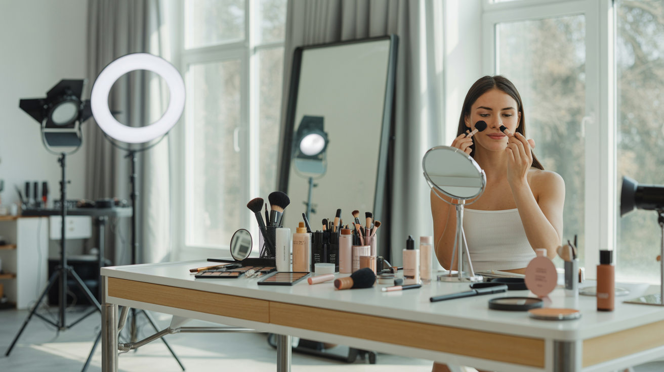
DIY photography: Modern smartphones have excellent cameras capable of professional-quality photos with proper technique. For DIY headshots and professional photos, you need: a smartphone with good camera, a tripod or stable surface, natural window light or simple lighting setup, and a clean background. Position yourself facing a large window with soft, indirect light. Use your phone's timer or a remote shutter. Take many photos and choose the best. This approach costs almost nothing but requires time and experimentation.
Working with photographers: Professional photographers bring expertise in lighting, posing, and creating flattering images. When hiring a photographer, brief them on your visual brand using your style guide. Show reference photos of the aesthetic you want. Discuss your color palette, preferred backgrounds, and desired mood. A good photographer will understand your vision and execute it beautifully. Expect to pay $200-800 for headshots, $500-2000 for comprehensive branding sessions.
AI photo enhancement: Tools like Glowup offer a middle ground between DIY and professional photography. Take your own photos using a smartphone, then use AI to enhance them to professional quality—improving lighting, smoothing skin naturally, enhancing colors, and creating polish that rivals professional photography. This approach combines the cost-effectiveness of DIY with the quality of professional work. It's particularly valuable for maintaining consistency across photos taken at different times and places.
Photo organization: Managing your professional photo library requires simple organization. Create a folder structure: Originals (unedited source files), Edited (final versions ready to use), Archive (older photos you're no longer using). Within each folder, organize by date and type (headshots, full-body, lifestyle, etc.). Name files descriptively: "YourName_Headshot_Navy_2026.jpg" rather than "IMG_1234.jpg". This organization makes finding the right photo quick and easy.
Style guides and templates: Document your visual brand in a simple one-page PDF that includes your brand attributes, color palette, background preferences, lighting style, expression guidelines, and reference photos. Tools like Canva offer free templates for creating professional-looking style guides. Share this document with photographers, designers, and anyone helping with your visual branding.
When to invest in what: Start with your primary headshot—this is worth professional photography or at minimum, AI enhancement of a high-quality DIY photo. For secondary variations and full-body photos, DIY with AI enhancement often produces excellent results. For working and lifestyle photos, DIY is usually sufficient as these photos are meant to feel more natural and candid. For comprehensive branding sessions when you need 15-20 photos at once, professional photography is often worth the investment.
> Transform your professional photos with AI that understands visual consistency. Create your cohesive professional photo library today at https://glowuplab.app/signup
Maintaining Your Visual Brand Over Time
Visual brand consistency isn't a one-time project—it's an ongoing practice. Your appearance changes, your career evolves, and your photos need to keep pace while maintaining the core consistency that makes you recognizable.
When to update your photos: Plan to refresh your photo library every 12-18 months as a baseline. Update sooner if you make significant appearance changes—new hairstyle, hair color change, significant weight change, new glasses, or any other change that makes you look noticeably different from your current photos. Also update when your career makes a significant shift that requires different positioning—moving from corporate to entrepreneurship, changing industries, or stepping into more senior roles.
Evolving your visual brand without losing recognition: As your career evolves, your visual brand can evolve too—but gradually, not dramatically. If you're moving from corporate to entrepreneurship, you might shift from formal suits to smart casual over time, not overnight. If you're becoming more established in your field, you might shift from bright, energetic lighting to more sophisticated, dramatic lighting gradually. The key is evolution, not revolution. Your audience should recognize you through the changes.
Seasonal updates while maintaining core consistency: If you create regular content or work in industries where seasonal relevance matters, consider shooting seasonal photo variations. Your summer photos might show lighter colors and outdoor settings, while winter photos show richer colors and indoor settings. The core elements—your expression, overall aesthetic, quality level—remain consistent, but seasonal variations keep your content feeling current.
Adding new photo types as your career evolves: As you take on new roles or activities, add corresponding photos to your library. If you start speaking professionally, add photos of yourself presenting. If you write a book, add photos with the book. If you start a podcast, add photos with microphone/recording setup. These new photo types should align with your existing visual brand—same color palette, similar backgrounds, consistent lighting mood.
The long-term value of visual brand consistency: Professionals who maintain visual brand consistency over years build powerful recognition and trust. When someone encounters your content repeatedly over time and always sees consistent, professional visual branding, they develop confidence in your stability, professionalism, and attention to detail. This long-term consistency becomes a competitive advantage that's difficult for others to replicate.
Think of visual brand consistency as compound interest for your professional reputation. Each consistent photo is a small deposit. Over time, these deposits accumulate into significant recognition and trust that opens doors, creates opportunities, and establishes authority.
Conclusion
Visual brand consistency through professional photos isn't about vanity or perfectionism—it's about strategic professional positioning. In a world where first impressions happen online, where people research you across multiple platforms before ever meeting you, and where visual content dominates professional communication, your photos are working for or against you every single day.
The scattered professional image problem—different photos, different styles, different quality across platforms—undermines trust and recognition. The solution is straightforward: build a cohesive visual brand through consistent professional photos that share core elements (color palette, background style, lighting mood, expression) while allowing appropriate variation.
The strategic advantage of cohesive professional photos is measurable. You become more memorable, more recognizable, more trustworthy. People form clear mental images of you that stick. Your professional brand feels intentional and polished rather than haphazard and amateur. Opportunities increase because you're top-of-mind when people think of your expertise.
The action steps are clear: First, audit your current photos across all platforms and identify inconsistencies. Second, define your visual brand using the framework in this guide—brand attributes, color palette, background style, lighting mood, expression. Third, create your photo library strategically through professional photography, DIY with AI enhancement, or a combination. Fourth, implement consistently across all platforms. Fifth, maintain and evolve your visual brand over time.
The investment is modest—a few hundred dollars for professional photography or AI enhancement, a few hours for planning and implementation. The return is substantial—increased recognition, enhanced trust, more opportunities, stronger professional brand.
Your photos represent you in the digital world. Make sure they're telling a consistent, compelling story about who you are professionally. Visual brand consistency isn't complicated, but it does require intentionality. The professionals who master it gain a competitive advantage that compounds over time.
Glowup makes professional visual branding accessible to everyone. Whether you're building your photo library from scratch or enhancing existing photos to professional quality, AI-powered enhancement ensures consistency, quality, and polish across all your professional photos. Your visual brand is too important to leave to chance—build it strategically, maintain it consistently, and watch it open doors throughout your career.