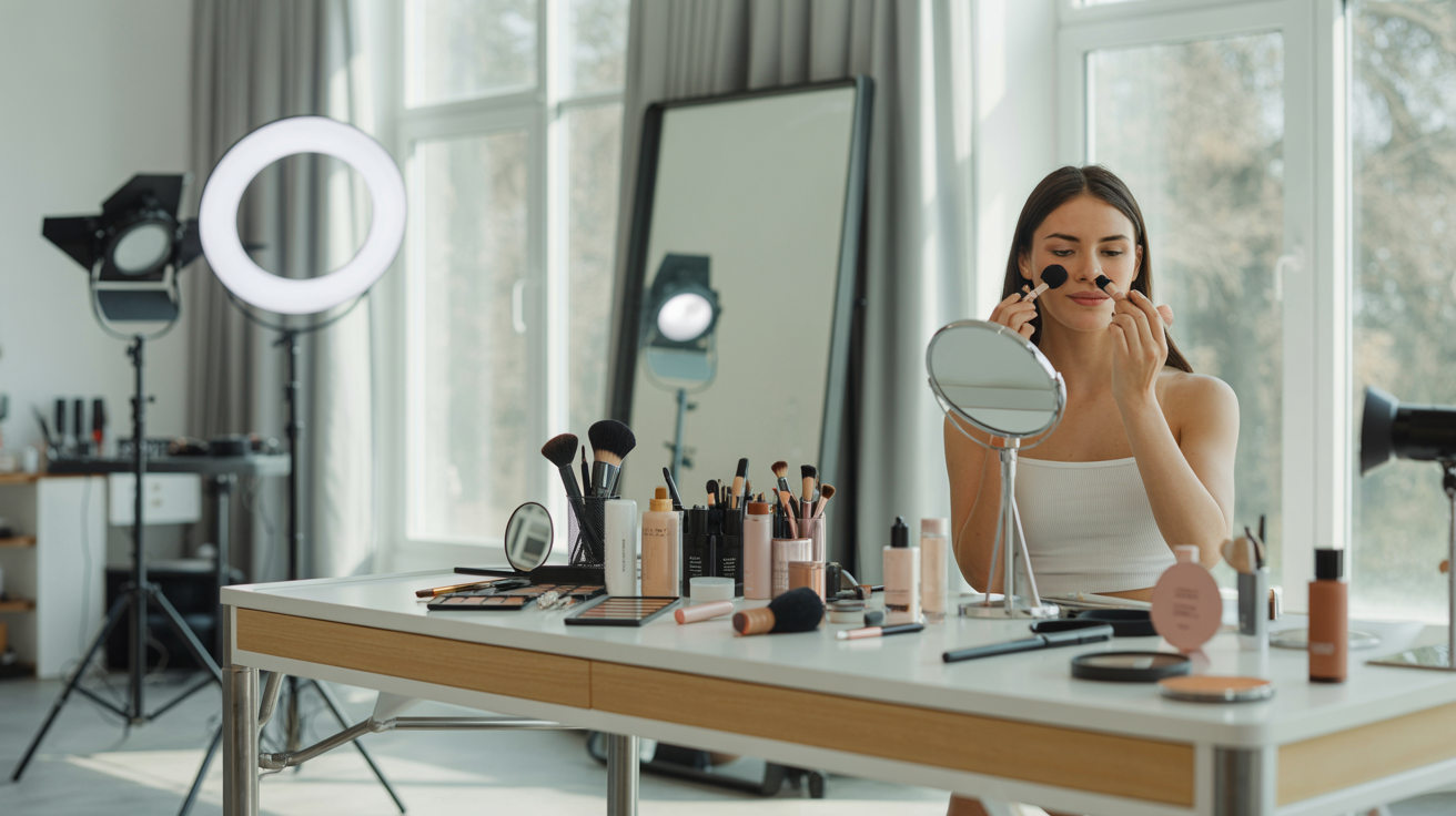
You've planned the shoot, found the perfect location, nailed your pose — and then the photos come back looking… off. The outfit you loved in the mirror looks washed out, clashes with the background, or somehow makes your skin look sallow. The culprit? Color.
Color is one of the single most impactful — and most overlooked — elements of any photo. Whether you're taking headshots for LinkedIn, shooting brand photos for your business, creating content for social media, refreshing your dating profile, or generating AI-enhanced images on a platform like Glowup, the colors you wear will shape how the final image looks and feels. The right color choice can make your eyes sparkle, your skin glow, and your entire presence feel magnetic. The wrong one can flatten your features, create distracting visual noise, or make you disappear into the background entirely.
The good news? You don't need to be a designer or a photographer to understand the basics of color theory for photos. This guide will walk you through everything you need to know — from why colors behave differently on camera, to the specific shades that almost always photograph well, to how to match colors to your skin tone, your context, and your goals. By the end, you'll have a practical, personalized color palette that makes every photo look effortlessly polished.
Why Colors Look Different on Camera Than in Real Life
Before diving into specific color recommendations, it's worth understanding a fundamental truth: what you see with your eyes is not what your camera sees. This disconnect trips up almost everyone, and it's the reason that shirt you loved in the store can look completely different in a photograph.
How Camera Sensors Interpret Color
Your eyes perceive color through a complex interplay of light, context, and neural processing. Cameras, by contrast, rely on digital sensors that capture light data and process it through algorithms. These sensors have limitations. They compress a vast range of visible light into a narrower digital spectrum, which means subtle color variations can get lost, and certain hues can shift in unexpected ways. A deep burgundy might read as muddy brown. A soft lilac might appear washed-out grey. A vibrant coral might turn into an aggressive neon orange.
White Balance and Lighting
Camera white balance — the setting that determines what "white" looks like in a given lighting situation — has an enormous effect on how every color in the frame is rendered. Under warm tungsten lighting, blues might appear muted while yellows intensify. Under cool fluorescent lights, warm tones can look greenish. Outdoor shade shifts everything slightly blue. The same outfit can look dramatically different depending on the light source, time of day, and white balance setting.
Screen Display Variation
Even after the photo is taken, colors shift again depending on the screen displaying them. Your phone, your laptop, a recruiter's monitor, and a social media app's compression algorithm will each render colors slightly differently. This means the colors in your photos need to be robust enough to look good across multiple displays — not just the one you're editing on.
Why Testing Matters
All of this adds up to one critical takeaway: never assume a color will photograph well just because it looks good in person. Always test your outfit colors on camera, in conditions as close to the final shoot as possible, before committing. Five minutes with your phone camera can save you from an entire set of photos that don't land.
The Colors That Almost Always Photograph Well
While every situation is different, certain color families have a strong track record of looking beautiful on camera across a wide range of skin tones, lighting conditions, and backgrounds. If you're looking for a safe starting point, these are your best bets.
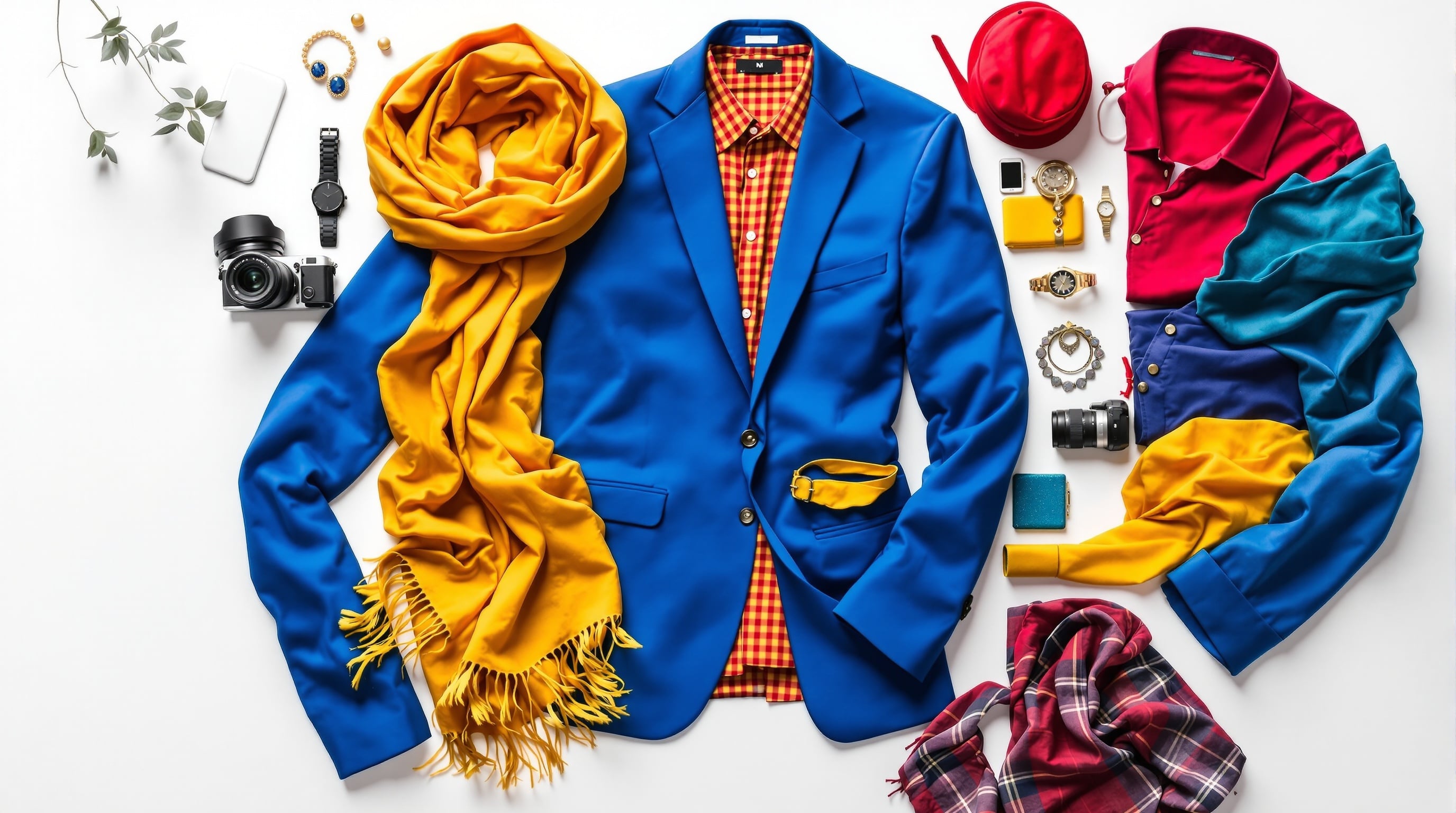
Deep Jewel Tones
Navy, emerald green, burgundy, deep teal, sapphire blue, and plum are some of the most universally photogenic colors. They're rich enough to create visual interest without being so bright that they overwhelm the frame. Jewel tones tend to retain their depth and saturation on camera, and they complement a wide range of skin tones. Navy, in particular, is a near-universal winner — it reads as polished and professional without the pitfalls of black (more on that below), and it flatters warm and cool complexions alike.
Soft Neutrals
Slate grey, warm taupe, dusty rose, camel, soft olive, and muted lavender are quietly powerful choices for photos. They don't compete with your face for attention, which makes them ideal for headshots and portraits where you want the focus squarely on your expression. Soft neutrals also pair beautifully with almost any background, from clean studio backdrops to natural outdoor settings.
Classic White and Off-White
A crisp white top or shirt is a timeless choice for photos — it looks clean, fresh, and universally flattering. However, pure bright white comes with caveats (see the next section). Off-white, cream, and ivory tend to be safer choices, as they give you the clean aesthetic without the overexposure risk. If you're shooting against a white background, skip white entirely and opt for a soft neutral or jewel tone instead.
Earth Tones for Warmth
Terracotta, rust, warm brown, olive, mustard, and burnt sienna bring a grounded, approachable warmth to photos. These colors photograph especially well outdoors and in natural light, and they pair beautifully with wood, brick, greenery, and other organic textures. If your personal brand or aesthetic leans warm, natural, or earthy, this palette is your sweet spot.
Colors to Approach with Caution (and How to Make Them Work)
Not every color is a guaranteed winner on camera. Some are trickier to pull off — but that doesn't mean you have to avoid them entirely. Here's how to navigate the most common pitfalls.
Neon and Oversaturated Colors
Neon green, hot pink, electric blue, and other highly saturated hues can cause problems on camera. They tend to "vibrate" visually, creating a buzzing effect that draws the eye away from your face. They can also reflect colored light onto your skin, giving you an unnatural cast. If you love bold colors, dial back the saturation one or two notches — a vibrant cobalt blue will photograph much better than an electric blue, and a rich fuchsia outperforms a neon pink every time.
Pure Bright White
While white is a classic choice, pure bright white can overexpose in strong lighting, creating a blown-out area in the photo where detail is completely lost. This is especially problematic in outdoor shoots with direct sunlight. The fix is simple: choose off-white, cream, or ivory instead, or ensure your photographer (or AI tool) can manage exposure carefully.
Very Dark Black
Black is sophisticated and slimming, but on camera it can absorb so much light that texture and detail disappear entirely, leaving a shapeless dark mass. This is especially true in low-light conditions or against dark backgrounds. If you want to wear black, look for pieces with visible texture — a knit sweater, a linen shirt, a jacket with subtle stitching — that give the camera something to "read." Alternatively, consider very dark navy or charcoal, which give you the same sleek effect with better detail retention.
Busy Patterns and Multi-Color Combinations
Small, tight patterns like thin stripes, tiny polka dots, herringbone, and plaid can create a moiré effect on camera — a distracting visual shimmer caused by the pattern interacting with the camera's sensor grid. Large, bold patterns can distract from your face. In general, solids photograph most reliably. If you love patterns, choose larger-scale prints in muted colors, and always test them on camera before your shoot.
Matching Colors to Your Skin Tone for Photos
The most photogenic color for you specifically depends on your skin's undertone — the subtle warm, cool, or neutral cast beneath your skin's surface. Understanding your undertone is the single most valuable thing you can do for your color choices.
How to Identify Your Undertone
There are several quick tests. Look at the veins on the inside of your wrist: if they appear more blue or purple, you likely have cool undertones; if they appear more green, you likely have warm undertones; if you see a mix of both, you're probably neutral. Another test: hold a piece of pure white paper next to your face in natural light. If your skin looks slightly yellowish or peachy by comparison, you're warm. If it looks slightly pinkish or bluish, you're cool.
Best Colors for Warm Undertones in Photos
If you have warm undertones, you'll generally photograph best in colors with warm bases: earthy reds, terracotta, rust, olive green, warm browns, mustard, peach, coral, cream, and warm-toned jewel colors like amber and warm emerald. These colors harmonize with the natural warmth in your skin, creating a cohesive, glowing effect on camera.
Best Colors for Cool Undertones in Photos
Cool undertones tend to shine in colors with blue or pink bases: true navy, cobalt blue, cool grey, lavender, plum, berry, icy pink, emerald green with a blue base, burgundy, and crisp white. These colors create a clean, striking contrast that photographs beautifully, especially in studio or professional settings.
Neutral Undertones: The Most Flexible
If you have neutral undertones, congratulations — you have the widest range of colors that photograph well on you. You can pull from both the warm and cool palettes with equal success. Your best strategy is to focus on medium-saturation colors (avoiding extreme brights or extreme pastels) and to choose colors based on the mood and context of the shoot rather than worrying about undertone compatibility.
Choosing Colors for Different Photo Contexts
The best color for your photo isn't just about what flatters your skin — it's also about what fits the context. A color that works perfectly for a LinkedIn headshot might not be the best choice for a lifestyle brand shoot.
LinkedIn Headshots and Professional Photos
For professional photos, you want colors that convey competence, approachability, and polish. Deep navy, charcoal grey, soft white, burgundy, and forest green are all excellent choices. Avoid overly casual colors (bright orange, neon), overly trendy shades that may date quickly, and anything too flashy. The goal is for the viewer to notice you — your face, your expression, your confidence — not your outfit.
Brand Photos for Small Business Owners
If you're a business owner or entrepreneur, your brand photos should incorporate your brand's color palette. This doesn't mean wearing your exact brand colors head-to-toe — it means using complementary or analogous colors that create visual harmony with your brand aesthetic. If your brand palette is warm and earthy, wear warm neutrals. If it's cool and minimal, wear clean blues and greys. Consistency between your brand visuals and your personal photos creates a cohesive professional image.
Social Media Content and Personal Branding
For social media, you have more creative freedom — but consistency still matters. Choose two or three signature colors that you return to frequently in your content. This creates a recognizable visual identity across your feed. Consider how your outfit colors interact with your typical posting backgrounds, filters, and editing style.
Product Photos Featuring People
If you're modeling alongside a product, your outfit should complement — never compete with — the product's colors. Choose neutral or muted tones that allow the product to be the visual star. If the product is neutral, you can add a pop of color to create interest, but keep it subtle.
Ready to see how different outfit colors look on you before committing to a shoot? Glowup lets you generate AI-enhanced photos in a variety of settings and styles — an easy way to test colors, outfits, and looks without the time and cost of a traditional photoshoot.
Background Color and Outfit Color: How to Coordinate
Your outfit doesn't exist in isolation — it interacts with everything else in the frame, and the background is the biggest factor. Getting the outfit-background relationship right is one of the simplest ways to elevate your photos.
Contrast Is Your Friend
The most visually striking photos have clear contrast between the subject and the background. If the background is dark, wear something lighter. If the background is light or white, choose a deeper or more saturated color. If the background is colorful (a mural, a garden, a busy street), wear a solid neutral that lets you stand out without clashing.
Avoiding Color Clashes with Common Backgrounds
Certain outfit-background combinations create unintentional problems. Green outfits against green foliage can cause you to blend in. Red against orange or brick can create an unpleasant visual tension. Cool-toned outfits against warm-toned backgrounds (or vice versa) can feel disconnected. Before your shoot, find out what the background will look like and choose your outfit accordingly.
Using Color to Direct Attention to Your Face
In any portrait or headshot, the viewer's eye should land on your face first. You can use color strategically to make this happen: wear a color that's slightly less intense than your natural coloring, so your features — your eyes, your smile, your expression — remain the brightest and most interesting thing in the frame. Avoid wearing colors that match your eye color exactly, as this can create a strange twinning effect that pulls focus away from your gaze.
Practical Tips for Testing Colors Before Your Shoot
Theory is valuable, but nothing beats real-world testing. Here are three practical ways to test your color choices before the big day.
The Phone Camera Test
The simplest test is to hold each potential outfit up to your face (or put it on), stand near a window for natural light, and take a quick selfie with your phone. Compare the photos side by side. Which colors make your skin look healthiest? Which ones make your eyes pop? Which ones fall flat? This ten-minute exercise eliminates most color mistakes before they happen.
Testing in the Actual Lighting Conditions
If you have access to your shoot location ahead of time, do your color test there. Lighting is everything — a color that looks amazing near your kitchen window might look completely different in a studio or an outdoor park at golden hour. If you can't visit the location, ask your photographer about the lighting setup and test with a similar light source at home.
Getting a Second Opinion
Color perception is subjective, and we all have blind spots about how we look on camera. Ask a trusted friend, a colleague, or a style-savvy person in your life to weigh in on your color test photos. Fresh eyes catch things you'll miss, especially when it comes to subtle skin tone effects.
Building a Photo-Ready Color Palette for Your Wardrobe
Rather than scrambling to find the right outfit before every shoot, build a small capsule collection of photo-ready pieces that you can reach for anytime.
Choosing 3–5 Core Colors That Work for You
Based on your skin tone testing and the guidelines above, identify three to five colors that consistently photograph well on you. These become your go-to photo colors. For many people, this palette includes one deep neutral (navy or charcoal), one soft neutral (camel, dusty rose, or warm grey), one jewel tone (emerald, burgundy, or teal), and one versatile light option (cream, soft white, or light blue).
Mixing and Matching for Variety
With just a few core colors, you can create a surprising range of looks by mixing tops, layers, and accessories. A navy blazer over a cream top reads differently than a burgundy sweater over dark denim, even though both combinations draw from the same core palette. Layering also adds visual texture and depth to photos, which cameras love.
Seasonal Considerations
While your core palette stays consistent, you can rotate seasonal accent colors. Warm rusts and olives for autumn shoots. Cool blues and soft whites for summer. Deep jewel tones for winter. Fresh pastels (in muted, not bright, versions) for spring. This keeps your photo wardrobe feeling current without requiring a complete overhaul each season.
Put Your Color Knowledge Into Action
Color theory for photos isn't complicated — but it is powerful. The difference between a photo where you look washed out and one where you absolutely glow often comes down to nothing more than the color of your shirt. By understanding how cameras interpret color, identifying the shades that work for your unique skin tone, matching your color choices to your context, and testing before you shoot, you set yourself up for photos that look polished, intentional, and magnetic every single time.
And if you want to experiment with different colors, outfits, and looks without booking a photographer or spending hours in front of a camera, Glowup makes it easy. Upload your photos, generate AI-enhanced images across a variety of styles and settings, and see exactly how different colors and looks work on you — all from your phone or laptop. It's the fastest way to build a library of stunning, on-brand photos that you actually love.
Your best color is out there. Now go find it.