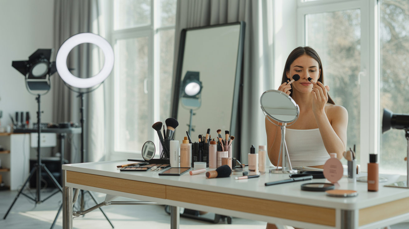
You've taken a great photo. The lighting is good, the composition works, and you're genuinely happy with how you look. Then you open your favorite editing app, make a few adjustments, apply a filter, tweak the colors, and... somehow the photo looks worse than when you started. The colors are too intense, your skin looks plastic, or the whole image has an artificial, over-processed quality that screams "amateur editing."
This frustrating scenario plays out thousands of times daily across social media feeds, professional portfolios, and business websites. People spend time editing their photos with the best intentions—wanting to look polished and professional—only to create results that look unnatural, fake, or simply worse than the original. The irony is painful: the effort to improve actually diminishes quality.
The problem isn't that photo editing is inherently bad. Professional photographers and content creators edit every single image they publish. The difference is that professional editing enhances what's already there, while amateur editing transforms photos into something unrecognizable and artificial. The line between enhancement and over-editing is subtle but crucial, and most people cross it without realizing.
This comprehensive guide will walk you through the 10 most common photo editing mistakes that make images look worse, explain exactly why each mistake is problematic, and teach you how to fix them for natural, professional results. Whether you're editing headshots for LinkedIn, creating social media content, updating your small business marketing materials, or simply want better personal photos, understanding these mistakes will transform your editing approach. You'll learn to enhance rather than transform, creating images that look polished and professional while maintaining authenticity and natural beauty.
The best part? Once you understand these principles, you'll develop an eye for good editing that serves you forever. You'll stop making these mistakes, recognize them in others' work, and create consistently better photos across all your personal and professional needs. Let's dive into what's going wrong and how to fix it.
Why Photo Editing Goes Wrong: Understanding the Problem
Before we examine specific mistakes, it's important to understand why photo editing so often goes off the rails. The root causes are surprisingly consistent across skill levels and editing tools.
The "more is better" trap is perhaps the most common culprit. When you first discover editing sliders—saturation, contrast, sharpness, clarity—there's a temptation to push them higher, assuming more adjustment equals better results. This is rarely true. Professional editing is about subtle, precise adjustments that enhance without overwhelming. A saturation increase of 10-15 points might be perfect; 50 points creates a cartoonish disaster.
Lack of editing fundamentals compounds the problem. Most people learn editing through trial and error or by copying what they see on social media, without understanding the underlying principles of color theory, exposure, or composition. They know how to move sliders but not why or when to move them. This leads to random adjustments that sometimes work but often don't.
Copying trends without understanding principles creates another layer of problems. When a particular editing style becomes popular—ultra-saturated colors, heavy vignettes, extreme contrast—people replicate it without considering whether it suits their specific photos or purposes. A moody, high-contrast edit might work beautifully for artistic portraits but look ridiculous on professional headshots.
Not viewing edits on different devices and screens is a technical mistake with significant consequences. An edit that looks perfect on your phone screen might appear oversaturated on a desktop monitor, too dark on a tablet, or washed out when printed. Professional editors check their work across multiple devices to ensure consistency.
Finally, editing fatigue and losing objectivity affect everyone. After staring at the same photo for 20 minutes, making countless micro-adjustments, you lose the ability to judge whether your edits are improving or degrading the image. Your eyes adapt to the changes, making extreme edits seem normal. This is why professional editors take breaks and return to images with fresh eyes.
Understanding these root causes helps you avoid them. Now let's examine the specific mistakes that result from these underlying problems.
Mistake #1: Over-Saturating Colors (Making Everything Too Vibrant)
The saturation slider is seductive. Move it to the right, and colors become more vivid, more eye-catching, more Instagram-worthy. Keep moving it, and you cross from "vibrant" into "cartoonish" without realizing it.
Over-saturation is the single most common editing mistake. It happens when you push the saturation slider too high, making all colors in the image unnaturally intense. Blues become electric, greens turn neon, and most problematically, skin tones shift orange or red, making people look sunburned or jaundiced.
Why is this so bad? Human eyes are incredibly sensitive to natural skin tones. We've evolved to read subtle variations in skin color for health, emotion, and social cues. When skin tones are even slightly off—too orange, too red, too saturated—our brains immediately register something wrong, even if we can't articulate what. The photo feels fake and untrustworthy.
Beyond skin tones, over-saturated colors simply don't exist in nature. When every color in your photo is cranked to maximum intensity, the image loses the subtle color variations that create depth, realism, and visual interest. Everything becomes flat and artificial, like a bad video game rendering.
How to fix it: Use the vibrance slider instead of saturation. Vibrance intelligently boosts muted colors while protecting already-saturated colors and skin tones. It gives you the color pop you want without the artificial, over-processed look. In most editing apps, vibrance is the smarter, more sophisticated cousin of saturation.
For more control, use selective color adjustments. Instead of boosting all colors equally, adjust specific color ranges. Boost the blues in the sky, enhance the greens in foliage, but leave skin tones alone. This targeted approach creates vibrant images that still look natural.
The professional rule: If you're editing a photo with people, keep skin tones natural at all costs. You can push other colors further, but skin must look like skin. Use the saturation slider sparingly—adjustments of +10 to +15 are usually sufficient. Anything beyond +25 is almost always too much.
Tools like Lightroom, Snapseed, and VSCO all offer both saturation and vibrance controls. Learn the difference and use vibrance as your default color enhancement tool.
Mistake #2: Excessive Skin Smoothing (The Plastic Face Effect)
Smooth, flawless skin is desirable, but there's a crucial difference between retouching blemishes and erasing all skin texture. Unfortunately, many editing apps make it far too easy to cross this line, creating the dreaded "plastic face" effect where skin looks artificially smooth, waxy, and completely fake.
Excessive skin smoothing happens when you over-use blur, smoothing, or "beauty" tools that are designed to reduce skin texture. These tools can be helpful for minimizing temporary blemishes—a pimple, a scratch, redness from allergies—but when applied too aggressively, they remove the natural texture that makes skin look like skin.
The result is uncanny valley territory. The person in the photo looks almost human but not quite, triggering an instinctive discomfort in viewers. Professional headshots, personal branding photos, and business images with excessive smoothing undermine credibility rather than enhancing it. They signal insecurity, inauthenticity, and amateur editing.
The professional approach to skin retouching is simple: retouch blemishes, not skin texture. Remove temporary imperfections—pimples, scratches, stray hairs—but preserve the natural texture of skin, including pores, fine lines, and subtle variations in tone. This creates a polished, professional look that still appears authentic and human.
How to fix it: Use spot healing or clone tools to address specific blemishes rather than applying blanket smoothing to entire areas. Work at 100% zoom to see exactly what you're doing. Remove the pimple, not the pores around it.
If you must use smoothing tools, apply them at very low opacity (20-30%) and only to specific areas. Many apps allow you to adjust the strength of smoothing effects—always start at the lowest setting and increase only if necessary.
For advanced users, frequency separation is the professional technique for skin retouching. It separates texture from color, allowing you to even out skin tone while preserving natural texture. This technique requires more skill but produces far superior results.
Here's where AI enhancement often outperforms manual editing. Quality AI tools like Glowup are trained on thousands of professionally retouched photos and understand the subtle balance between smoothing blemishes and preserving natural texture. They can remove a pimple while keeping the pore structure intact—something that's difficult to do manually without significant skill.
The golden rule: If you can't see pores, you've smoothed too much. Natural skin has texture. Embrace it.
Mistake #3: Cranking Contrast to Extremes (Losing Detail in Shadows and Highlights)
Contrast makes images pop. It creates visual impact, separates subjects from backgrounds, and adds drama to flat photos. But like all editing adjustments, contrast becomes problematic when pushed to extremes.
Excessive contrast happens when you push the contrast slider too far in either direction. Too much contrast creates "crushed blacks" (shadow areas that become pure black with no detail) and "blown highlights" (bright areas that become pure white with no detail). Too little contrast creates flat, muddy images that lack visual impact.
The problem with crushed blacks and blown highlights is lost information. When shadows go completely black, you lose all the subtle detail in darker areas—the texture of clothing, the definition of hair, the depth in background elements. When highlights blow out to pure white, you lose detail in bright areas—the texture of white shirts, the subtle variations in sky, the definition in light-colored objects.
Professional photos maintain detail across the entire tonal range, from the darkest shadows to the brightest highlights. This is called preserving dynamic range, and it's what separates amateur snapshots from professional images.
How to fix it: Instead of using the contrast slider, use curves for precise control over different tonal ranges. Curves allow you to adjust shadows, midtones, and highlights independently, creating contrast where you want it while preserving detail throughout the image.
Most editing apps also offer separate shadow and highlight sliders. Use these to recover detail in dark and bright areas before adjusting overall contrast. Lift shadows slightly to reveal detail in dark areas, pull down highlights to recover detail in bright areas, then add contrast to midtones for impact.
Learn to read the histogram—the graph that shows the distribution of tones in your image. If the histogram is bunched up against the left edge (all blacks) or right edge (all whites), you've lost detail. A good histogram shows information across the full range without clipping at either end.
The professional approach: Adjust shadows and highlights first to preserve detail, then add contrast to midtones for impact. This creates punchy, dynamic images that still maintain detail throughout.
> Tired of editing mistakes? Glowup's AI automatically enhances your photos with professional-quality results—no editing skills required. Try it free at glowuplab.app
Mistake #4: Applying Heavy Filters Without Adjustment (The Instagram Filter Trap)
Preset filters and one-click effects are incredibly convenient. They promise professional results with zero effort—just tap a filter and instantly transform your photo. The problem is that one-size-fits-all filters rarely fit all, and applying them at full intensity without adjustment creates inconsistent, often problematic results.
The Instagram filter trap happens when you apply preset filters at 100% intensity without considering your specific photo's lighting, colors, or subject matter. A filter designed for golden-hour outdoor portraits might look terrible on an indoor headshot. A moody, desaturated filter perfect for urban landscapes might drain the life from a vibrant product photo.
Filters are created with specific lighting conditions and subject matter in mind. When you apply them to photos that don't match those conditions, the results can be jarring—skin tones that turn green, skies that become unnaturally purple, or overall color casts that make everything look wrong.
The professional approach treats filters as starting points, not final solutions. Professional editors use presets to establish a general aesthetic direction, then adjust individual parameters to suit the specific photo. They reduce filter opacity, tweak color balance, adjust exposure, and fine-tune the result until it works for that particular image.
How to fix it: After applying a filter, immediately reduce its opacity to 50-70%. This gives you the filter's aesthetic while maintaining more of your original photo's natural qualities. Then adjust individual parameters—if the filter makes skin tones too warm, cool them down; if it darkens too much, increase exposure.
Better yet, create your own editing style by learning which specific adjustments create the look you want. Instead of relying on "Valencia" or "Clarendon," understand that you prefer slightly warm tones, moderate contrast, and subtle vignettes. Apply these specific adjustments to each photo, creating consistency without the one-size-fits-all problems of preset filters.
For business and professional photos, avoid trendy filters entirely. They date quickly and can undermine professional credibility. Stick to subtle, timeless adjustments that enhance without overwhelming.
Mistake #5: Over-Sharpening (Creating Halos and Artifacts)
Sharpness makes photos look crisp and professional. Lack of sharpness makes them look soft and amateur. So naturally, when people discover the sharpness slider, they push it high, assuming more sharpness equals better quality. Unfortunately, over-sharpening creates obvious artifacts that scream "bad editing."
Over-sharpening happens when you push sharpness, clarity, or structure sliders too high. The result is visible halos around edges (light outlines around dark objects, dark outlines around light objects), emphasized noise and grain, and an overall harsh, unnatural look. Skin texture becomes exaggerated, showing every pore and imperfection. Fine details become crunchy and artificial.
The technical reason: Sharpening works by increasing contrast along edges. A little edge contrast creates the perception of sharpness. Too much creates visible halos and artifacts. It's an optical illusion that works beautifully when subtle but fails spectacularly when overdone.
How to fix it: Always view your photo at 100% zoom when sharpening. What looks good at thumbnail size often looks terrible at full resolution. Sharpen until you see improvement, then back off slightly. The sweet spot is just before you start seeing halos.
Use sharpening masking to apply sharpening selectively to edges while protecting smooth areas like skin and sky. Most professional editing software includes masking options that let you control where sharpening is applied.
Understand that different outputs require different sharpening amounts. Photos for web and social media need less sharpening than photos for print. Photos viewed on phones need less than photos viewed on large monitors. Sharpen for your intended output.
The professional rule: Sharpening should always be the last step in your editing workflow, after all other adjustments. And remember—you can't fix a blurry photo with sharpening. If your photo is out of focus, sharpening will only emphasize the blur. Start with sharp, well-focused photos.
Mistake #6: Ignoring White Balance (Yellow or Blue Color Casts)
White balance is the foundation of good color in photos, yet it's one of the most commonly ignored adjustments. When white balance is off, everything in your photo has an unnatural color cast—too yellow (warm), too blue (cool), or too green/magenta (tint issues). No amount of other editing can fix photos with incorrect white balance.
White balance problems happen because different light sources have different color temperatures. Indoor incandescent bulbs are very warm (yellow/orange), fluorescent lights are often green, outdoor shade is cool (blue), and direct sunlight is relatively neutral. Your camera tries to compensate automatically, but it often gets it wrong, especially in mixed lighting situations.
The result: Photos where white objects aren't white, skin tones look unhealthy (too yellow, too blue, too green), and the overall image has an obvious color cast that makes everything look wrong. You might try to fix it by adjusting saturation or individual colors, but without correcting white balance first, you're building on a flawed foundation.
How to fix it: Adjust white balance before making any other color adjustments. In most editing apps, you'll find temperature (warm/cool) and tint (green/magenta) sliders. Move the temperature slider until whites look white and skin tones look natural. Adjust tint if there's a green or magenta cast.
Many apps include a gray point picker or white balance eyedropper. Click on something in your photo that should be neutral gray or white, and the app will automatically adjust white balance. This is often the fastest way to get accurate color.
For mixed lighting situations—like indoor photos with both window light and artificial light—you may need to compromise. Adjust white balance for the most important part of the image (usually faces) and accept that other areas might not be perfectly neutral.
The professional workflow: White balance first, then exposure, then contrast, then color adjustments. This order ensures you're building on an accurate color foundation.
Mistake #7: Poor Cropping Choices (Breaking Composition Rules)
Cropping seems simple—just cut out the parts you don't want, right? But poor cropping choices can ruin otherwise good photos by creating awkward framing, unbalanced composition, or cutting off body parts in unflattering ways.
Common cropping mistakes include cutting people off at joints (elbows, knees, ankles—always looks awkward), placing the subject dead center with no breathing room, cropping too tight and creating a claustrophobic feeling, ignoring the rule of thirds and creating unbalanced compositions, and not considering aspect ratios for different platforms (square for Instagram, vertical for Stories, horizontal for websites).
Why it matters: Composition guides the viewer's eye and creates visual balance. Poor cropping creates tension, awkwardness, and amateur-looking results, even if the photo itself is technically good.
How to fix it: Learn and apply the rule of thirds. Imagine your photo divided into a 3x3 grid. Place important elements along these lines or at their intersections rather than dead center. This creates more dynamic, professional-looking compositions.
Leave breathing room around your subject. Don't crop so tight that the subject feels cramped. Give them space to "look into" if they're facing to one side.
When cropping people, avoid cutting at joints. If you're cropping a full-body shot, crop above or below joints, never at them. For headshots, crop at mid-chest or shoulders, not at the neck (looks like a floating head).
Consider your platform and purpose. LinkedIn headshots work best in square or vertical formats. Website hero images need horizontal crops. Instagram feed posts are square, but Stories are vertical. Crop appropriately for where the photo will be used, or maintain enough space to crop differently for different platforms.
For product photos and business images, ensure the crop doesn't cut off important elements or create awkward negative space. The crop should feel intentional and balanced.
Mistake #8: Inconsistent Editing Across Multiple Photos (Ruining Visual Cohesion)
When you edit each photo individually without a consistent approach, the results might look fine in isolation but terrible together. This is particularly problematic for social media feeds, website galleries, professional portfolios, and business marketing materials where multiple photos are viewed together.
Inconsistent editing creates visual chaos. One photo is warm-toned, the next is cool. One is highly saturated, the next is muted. One is bright and airy, the next is dark and moody. Individually, each might be well-edited, but together they create a disjointed, unprofessional impression.
For personal branding and business marketing, visual consistency is crucial. It creates a recognizable aesthetic, signals professionalism and intentionality, and makes your content immediately identifiable. Inconsistent editing undermines all of this.
How to fix it: Create and save editing presets that capture your preferred style. Apply these presets as a starting point for all your photos, then make minor adjustments for each specific image. This ensures consistency while allowing for necessary variations.
Use batch editing for photos from the same shoot or session. Edit one photo to perfection, save those settings as a preset, then apply them to all similar photos. Make individual adjustments as needed, but start from the same baseline.
Establish editing guidelines for yourself or your team. Define your preferred color palette (warm or cool?), contrast level (high or low?), saturation approach (vibrant or muted?), and overall mood (bright and airy or dark and moody?). Document these preferences and apply them consistently.
Use reference photos to maintain consistency. Keep a few perfectly edited photos as references and compare new edits against them. This helps you maintain your established aesthetic across all your content.
For businesses with multiple people editing photos, create a style guide that documents specific editing parameters. This ensures everyone produces consistent results regardless of who's doing the editing.
Mistake #9: Editing on Small Screens Only (Missing Details and Issues)
In our mobile-first world, many people edit photos exclusively on their phones. While mobile editing apps are powerful and convenient, editing only on small screens creates problems you won't notice until it's too late.
The issues: Small screens hide details that become obvious on larger displays. Over-sharpening that looks fine on a phone looks harsh on a desktop monitor. Color accuracy varies significantly between devices—what looks perfect on your phone might appear oversaturated on a tablet or washed out on a laptop. You miss small imperfections, artifacts, and editing mistakes that are invisible at thumbnail size but obvious at full resolution.
Additionally, you can't accurately judge how your photos will appear to your audience if you only view them on one device. Your LinkedIn headshot will be viewed on desktop monitors. Your website photos will be seen on various screen sizes. Your social media content will appear on phones, tablets, and computers. Editing only on your phone means you're optimizing for one viewing context while ignoring others.
How to fix it: Check your edits on multiple devices before finalizing. Edit on your phone if that's most convenient, but view the results on a tablet and computer before publishing. Look for issues that weren't visible on the small screen.
When possible, use a calibrated monitor for critical editing. Color accuracy matters, and most phone and tablet screens aren't color-accurate. For professional headshots, business photos, and important personal branding images, edit on a properly calibrated display.
Always view your edits at 100% zoom, regardless of device. Zoom in to check sharpness, skin retouching, and detail work. What looks good at thumbnail size might reveal problems at full resolution.
Understand how your photos will be viewed and optimize accordingly. Social media photos viewed primarily on mobile can be edited on mobile. Professional headshots viewed on desktop monitors should be checked on desktop. Website hero images should be viewed at the size they'll actually appear.
The professional approach: Edit on the best screen available, then check on multiple devices before publishing. This ensures your photos look good everywhere, not just on the device you used for editing.
Mistake #10: Not Saving Original Files (Destroying Your Source Material)
This mistake doesn't affect how your photos look immediately, but it creates serious problems down the line. When you overwrite original photos with edited versions, you lose the ability to undo edits, re-edit with better skills later, or create different versions for different purposes.
The problem: Every time you save a JPEG, you lose quality due to compression. If you edit a photo and save it as a JPEG, then later edit that edited JPEG and save again, you're compounding quality loss. After several rounds of editing and saving, your photo degrades noticeably.
Additionally, editing techniques and trends change. What looks good today might look dated in a year. If you've overwritten your originals, you can't go back and re-edit with a fresh approach. You're stuck with your old edits or forced to work from degraded files.
How to fix it: Always maintain a non-destructive editing workflow. Keep your original files completely untouched. Save edited versions as separate files with descriptive names (original.jpg becomes original_edited.jpg or original_linkedin.jpg).
If your camera shoots RAW files, keep them. RAW files contain far more information than JPEGs and allow for much more extensive editing without quality loss. Even if you primarily work with JPEGs, keep the RAW originals.
Use editing software that supports non-destructive editing. Apps like Lightroom save your edits as instructions rather than creating new files, allowing you to change or remove edits at any time without degrading the original.
Implement a simple file management system. Create folders for originals (never touched), working files (in-progress edits), and finals (published versions). This organization prevents accidental overwriting and makes it easy to find any version you need.
For important photos, consider version control. Save multiple edited versions with descriptive names: headshot_linkedin.jpg, headshot_website.jpg, headshot_print.jpg. This allows you to optimize the same photo for different uses without losing any versions.
The professional rule: Originals are sacred. Never overwrite them. Storage is cheap; lost photos are irreplaceable.
The Right Way to Edit Photos: A Simple Workflow
Now that you understand what not to do, let's establish a proper editing workflow that produces consistently good results while avoiding common mistakes.
Step 1: Start with good source material. No amount of editing can fix a fundamentally bad photo. Ensure your original is properly exposed, in focus, and well-composed. If the photo is blurry, severely underexposed, or poorly framed, editing won't save it.
Step 2: Adjust white balance and exposure first. These are your foundation adjustments. Correct white balance to ensure accurate colors. Adjust exposure to get overall brightness right. Everything else builds on these fundamentals.
Step 3: Fine-tune contrast, shadows, and highlights. Recover detail in shadows and highlights, then add contrast to midtones for impact. Use curves or separate shadow/highlight sliders for precise control. Check your histogram to ensure you're not clipping blacks or whites.
Step 4: Adjust colors carefully. Use vibrance rather than saturation for color enhancement. Make selective color adjustments if needed. Keep skin tones natural. If you're using filters or presets, apply them now at reduced opacity, then fine-tune.
Step 5: Crop and straighten. Apply composition principles—rule of thirds, appropriate breathing room, avoiding awkward cuts. Consider your intended platform and aspect ratio. Straighten horizons and vertical lines.
Step 6: Spot corrections. Remove temporary blemishes, distracting elements, or small imperfections using spot healing or clone tools. Work at 100% zoom for precision. Remember: retouch blemishes, not texture.
Step 7: Sharpen (last step). View at 100% zoom. Apply sharpening conservatively. Use masking to protect smooth areas. Sharpen for your intended output (web, print, social media).
Step 8: Export for intended use. Choose appropriate file format (JPEG for web, TIFF for print). Set quality level (90-95% for web is usually sufficient). Resize if necessary for your platform. Save as a new file, preserving your original.
Throughout this workflow, follow the "less is more" principle. Make subtle adjustments that enhance rather than transform. If you're unsure whether an adjustment is too much, it probably is—back off slightly.
Take breaks to maintain objectivity. After 15-20 minutes of editing, your eyes adapt to the changes and you lose the ability to judge accurately. Step away, look at something else, then return with fresh eyes.
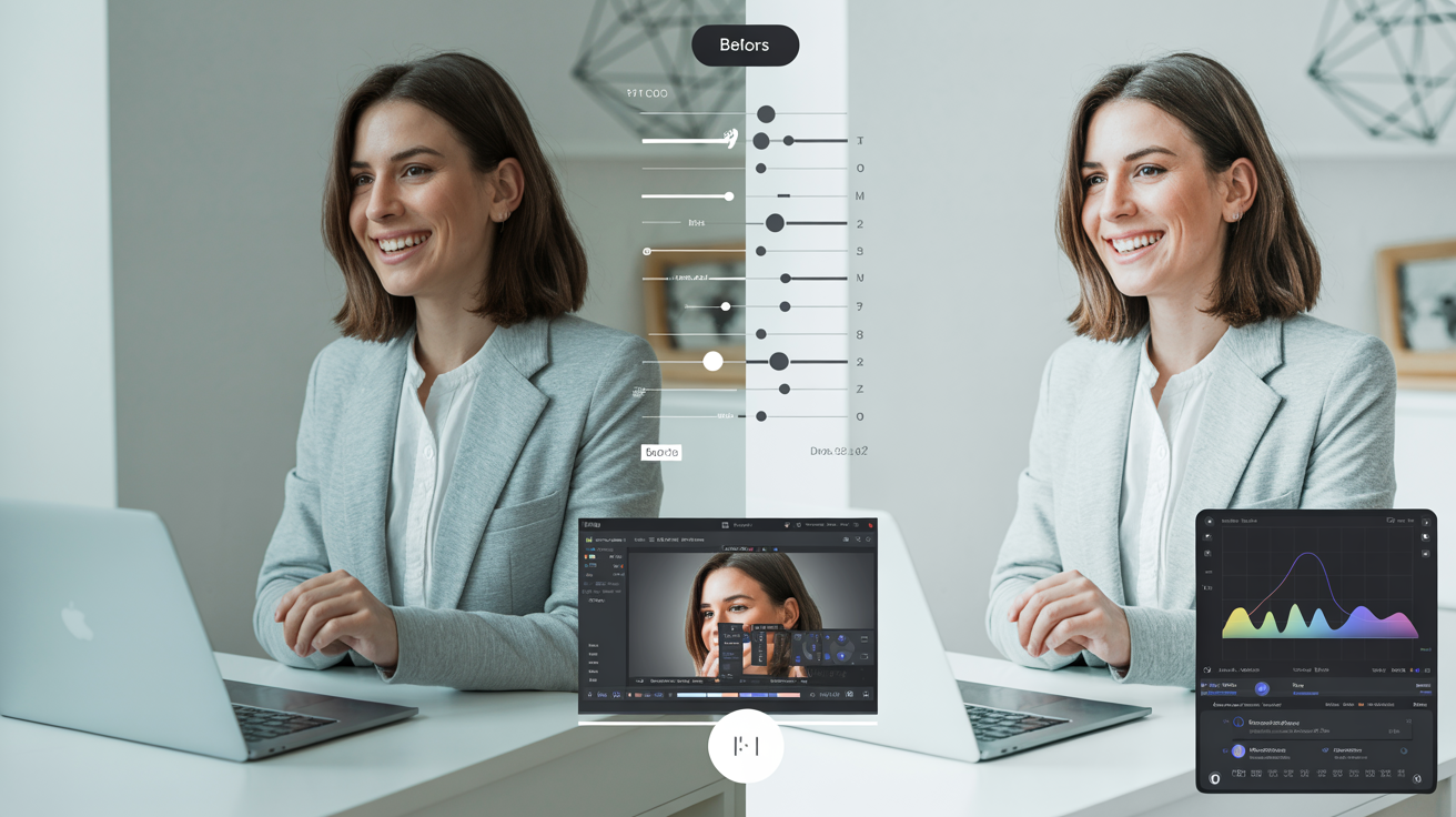
Compare your edit to the original periodically. Many editing apps have a before/after toggle. Use it to ensure your edits are actually improving the photo, not just changing it.
When to Use AI Enhancement Instead of Manual Editing
Understanding editing principles is valuable, but there's an increasingly compelling alternative: AI-powered enhancement that handles these technical details automatically while avoiding common mistakes.
AI enhancement excels in several situations. When you need consistent results across many photos, AI applies the same quality standards to every image. When you're short on time, AI delivers professional results in seconds rather than minutes or hours. When you lack editing skills or confidence, AI provides professional-quality enhancement without requiring technical knowledge.
What AI handles automatically: Modern AI tools trained on professionally edited photos understand the subtle balance between enhancement and over-editing. They can retouch skin naturally, preserving texture while minimizing blemishes. They correct color and lighting issues while maintaining natural tones. They enhance sharpness without creating halos or artifacts. They adjust contrast while preserving detail in shadows and highlights.
Essentially, AI has learned from thousands of professionally edited photos and applies those same principles to your images, avoiding all the common mistakes we've discussed in this guide.
When manual editing is still needed: AI enhancement works beautifully for standard enhancement—making good photos look great. But for creative effects, specific artistic visions, or heavy manipulation (removing large objects, changing backgrounds, dramatic transformations), manual editing provides more control.
The hybrid approach: Many professionals use AI for foundation enhancement, then add manual creative touches. Let AI handle the technical fundamentals—exposure, color correction, basic retouching—then manually add your creative vision on top of that solid foundation.
How Glowup's AI avoids common editing mistakes: Glowup is specifically trained to enhance photos naturally, avoiding the over-editing pitfalls that plague manual editing. It won't over-saturate colors, won't create plastic-looking skin, won't crush shadows or blow highlights, and won't over-sharpen. It applies professional-level enhancement that looks polished and natural, not fake and over-processed.
For professionals updating headshots, content creators producing regular social media content, small business owners creating marketing materials, or anyone who wants consistently great photos without becoming an editing expert, AI enhancement offers compelling advantages.
> Skip the editing mistakes and get professional results instantly. Sign up for Glowup at glowuplab.app/signup and transform your photos with AI that knows exactly how to enhance without over-editing.
Tools and Apps for Better Photo Editing
Whether you choose manual editing, AI enhancement, or a hybrid approach, having the right tools makes a significant difference. Here's a breakdown of the best options across different categories and skill levels.
Desktop editing software: Adobe Lightroom remains the industry standard for photo editing. It offers powerful, precise controls, non-destructive editing, excellent organization tools, and seamless integration with Photoshop for advanced work. The learning curve is moderate, but the results are professional-quality. Subscription-based pricing ($10/month for Photography plan).
Adobe Photoshop is for advanced editing, heavy manipulation, and creative work beyond standard photo enhancement. It's more complex than Lightroom but offers unlimited creative possibilities. Best for users who need advanced retouching, compositing, or graphic design capabilities.
Luminar AI (now Luminar Neo) combines traditional editing controls with AI-powered tools. It offers a good middle ground between manual control and AI automation. One-time purchase or subscription options available.
Mobile editing apps: Snapseed (free, iOS and Android) is the most powerful free mobile editing app. It offers professional-level controls including curves, selective adjustments, healing tools, and more. Excellent for users who want manual control on mobile devices.
VSCO (free with in-app purchases) is popular for its film-inspired presets and community features. Good for users who want a consistent aesthetic and enjoy preset-based editing. The free version offers basic tools; subscription unlocks full preset library.
Lightroom Mobile (free with in-app purchases) syncs with desktop Lightroom, allowing you to edit on mobile and continue on desktop. Excellent for users who work across devices. Free version offers solid editing tools; subscription unlocks advanced features and cloud storage.
AI-powered enhancement: Glowup specializes in automatic photo enhancement for headshots, portraits, and personal branding photos. It applies professional-level editing automatically, avoiding common mistakes while delivering natural, polished results. Ideal for professionals, content creators, and anyone who wants great results without editing skills.
Remini focuses on detail enhancement and restoration, particularly good for improving older or lower-quality photos. It can add impressive detail to faces and textures.
Facetune is portrait-specific, offering both automatic and manual retouching tools. Good for social media content and personal photos, though easy to over-edit if you're not careful.
Free vs. paid: What you actually need: For casual users editing occasional photos for social media, free tools like Snapseed or the free versions of VSCO and Lightroom Mobile are sufficient. For professionals, content creators, or small business owners who edit regularly, investing in Lightroom ($10/month) or AI enhancement tools like Glowup provides significant time savings and quality improvements. For advanced creative work, Photoshop is worth the investment.
Learning resources: YouTube offers countless free tutorials for every editing app. Search for "[app name] tutorial" plus your specific need. Adobe offers official tutorials for Lightroom and Photoshop. Most apps include built-in tutorials or help sections. Practice is the best teacher—edit regularly and you'll improve quickly.
Conclusion: Edit to Enhance, Not Transform
The fundamental principle underlying all good photo editing is simple: edit to enhance what's already there, not to transform it into something unrecognizable. Your goal is to create the best possible version of your photo while maintaining authenticity, natural beauty, and professional credibility.
The 10 mistakes we've covered—over-saturation, excessive smoothing, extreme contrast, heavy filters, over-sharpening, ignored white balance, poor cropping, inconsistent editing, small-screen-only editing, and not saving originals—all stem from the same root problem: pushing adjustments too far, applying techniques without understanding principles, or prioritizing trends over timeless quality.
The key principle that prevents all these mistakes: If someone would notice the editing, you've gone too far. Professional editing is invisible. It makes you look great while appearing completely natural. Amateur editing is obvious, creating that artificial, over-processed quality that undermines rather than enhances.
Developing your eye for good editing takes practice. Edit regularly, compare your work to professional examples, learn from your mistakes, and gradually you'll internalize these principles. You'll instinctively know when you've pushed saturation too far, when skin smoothing crosses into plastic territory, when contrast becomes excessive.
The confidence that comes from natural-looking, professionally edited photos is significant. Whether you're using these images for LinkedIn, your website, social media, business marketing, or personal purposes, knowing they look polished and professional while remaining authentic gives you the assurance to put yourself out there without hesitation.
Remember: Great photos start with good source material and thoughtful editing that enhances rather than transforms. Whether you choose to develop manual editing skills or leverage AI enhancement tools, understanding these principles ensures you'll create consistently better images across all your personal and professional needs.
Glowup makes professional editing accessible to everyone, applying these exact principles automatically to deliver natural, polished results without requiring editing expertise. It's the difference between spending 20 minutes manually editing each photo (and potentially making these mistakes) versus getting professional results in seconds.
Your photos represent you in the digital world. Make sure they're showing your best self—enhanced, polished, and professional, but always authentically you.